Background and font colours to reduce eye strain 论题张贴者: Philippe Locquet
|
|---|
I have started looking for what are considered the best options to reduce eye strain but there are not that many, and I don’t see a big number of options in CATs.
I personally like a dark grey on white bkgrd or white on dark grey bkgrd.
Dark themes, like those trending now, seem to be hard on the eyes too if there is a big contrast (i.e., white over black bkgrd). On mobile devices they preserve battery but are not that good at reducing eye strain.
So ideally, you would need ... See more I have started looking for what are considered the best options to reduce eye strain but there are not that many, and I don’t see a big number of options in CATs.
I personally like a dark grey on white bkgrd or white on dark grey bkgrd.
Dark themes, like those trending now, seem to be hard on the eyes too if there is a big contrast (i.e., white over black bkgrd). On mobile devices they preserve battery but are not that good at reducing eye strain.
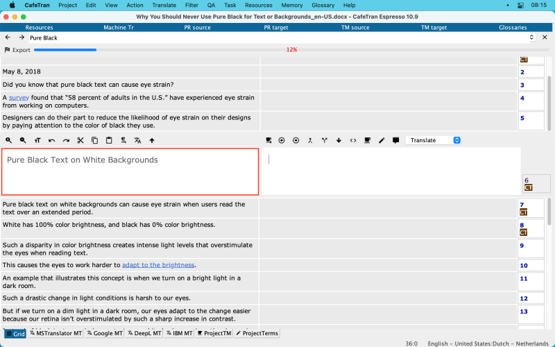
So ideally, you would need 1 of the two colours involved to have a lower contrast (see this article: https://uxmovement.com/content/why-you-should-never-use-pure-black-for-text-or-backgrounds/).
Then the next question is “which is best for translators”. True, we get to see a lot of information: different colours for different match scores, and in the text grammar and spelling live checking. And on top of all this, the high contrast of tracked changes when editing. More colours than Disneyland…
For long work hours, what do you feel is best?
I found this article testing options here for writers: https://glarminy.com/2016/10/29/eye-comfort-writers-editors/ but I’m not sold on the colours they chose…
Be well ▲ Collapse
| | | | | Beside colors and background, check you display too | Aug 27, 2021 |
Hi Phillipe,
I prefeer to use black/gray backgrounds, to reduce brightness on my eyes, but that it's a personal choice. Besides colours and fonts, did you check your screen? Recently I did a lot of investigationon the matter and I found that some displays have something called PWM flickering, which is a cheap technology who manufacturers uses to regulate screen brightness and may cause eye strain. Newer/better displays regulate brightness with another technic that doesn't cause eye strain... See more Hi Phillipe,
I prefeer to use black/gray backgrounds, to reduce brightness on my eyes, but that it's a personal choice. Besides colours and fonts, did you check your screen? Recently I did a lot of investigationon the matter and I found that some displays have something called PWM flickering, which is a cheap technology who manufacturers uses to regulate screen brightness and may cause eye strain. Newer/better displays regulate brightness with another technic that doesn't cause eye strain. Recently bought a BenQ display with Eye care features (Flicker-free, Blue-light filter, IPS panel ) and I can say my eyes are more comfortable with it.
Hope this helps ▲ Collapse
| | | |
Ezequiel Flores wrote:
Hi Phillipe,
I prefeer to use black/gray backgrounds, to reduce brightness on my eyes, but that it's a personal choice. Besides colours and fonts, did you check your screen? Recently I did a lot of investigationon the matter and I found that some displays have something called PWM flickering, which is a cheap technology who manufacturers uses to regulate screen brightness and may cause eye strain. Newer/better displays regulate brightness with another technic that doesn't cause eye strain. Recently bought a BenQ display with Eye care features (Flicker-free, Blue-light filter, IPS panel ) and I can say my eyes are more comfortable with it.
Hope this helps
Thanks for this, interesting aspect I hadn't looked at. I haven't got this issue and already use blue light filter on the monitor etc.
For those who want to test this, I found this link:
https://iristech.co/pwm-flicker-test/
Read it all and then click next to where it says "You can open this in your own browser"
My screen came back clean.
BTW, ProZ uses a low colour contrast: yellowish background and black or burgundy red, this is quite a good reading experience although to some it would look like dated colours. I like it.
| | | | Adieu 
Ukrainian乌克兰语译成English英语
+ ...
| If you can get the hardware and your CAT tool supports the settings | Aug 27, 2021 |
AMOLED screen, black background (physically off pixels, no backlight), high contrast font color of your preference
| | |
|
|
|
| Visual contrast | Aug 27, 2021 |
Philippe Locquet wrote:
BTW, ProZ uses a low colour contrast: yellowish background and black or burgundy red, this is quite a good reading experience although to some it would look like dated colours. I like it.
Just the opposite: of all colour combinations, black on yellow has a very high visual contrast, second only to blue on white, and it's good because the higher is the text contrast, the lower is eye fatigue.
| | | | | CafeTran Espresso | Aug 28, 2021 |
Philippe Locquet wrote:
I have started looking for what are considered the best options to reduce eye strain but there are not that many, and I don’t see a big number of options in CATs.
CafeTran Espresso's GUI can be configured to your needs via Themes, Colors and Fonts:
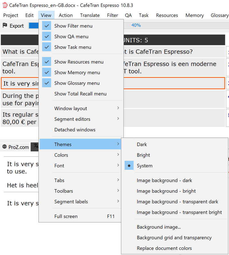
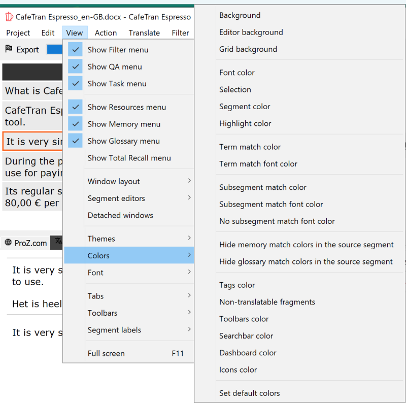
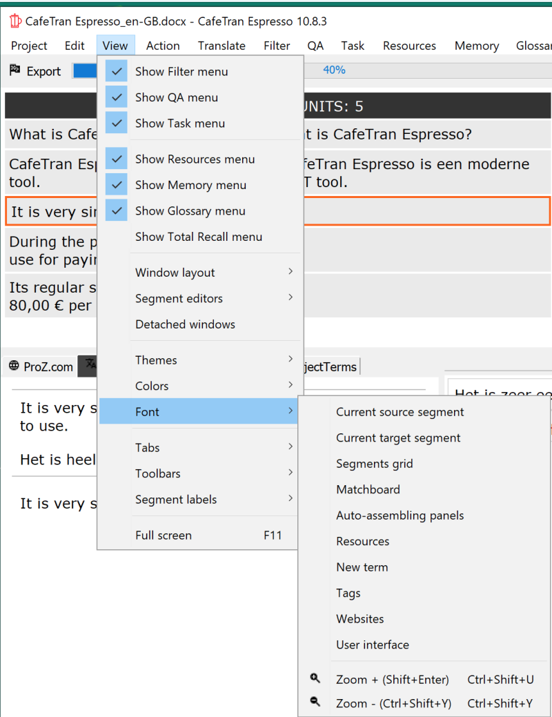
Here I've set the font color for the segment editors to dark grey:
[Edited at 2021-08-28 06:21 GMT]
| | | |
German Dutch Engineering Translation wrote:
CafeTran Espresso's GUI can be configured to your needs via Themes, Colors and Fonts:
That's great, thanks for the pictures! Nice feature indeed.
Which setting do you find best for you? Grey + white? I like it quite a bit.
| | | | Tina Vonhof (X)
加拿大
Local time: 04:32
Dutch荷兰语译成English英语
+ ...
Philippe Locquet wrote:
That's great, thanks for the pictures! Nice feature indeed.
Which setting do you find best for you? Grey + white? I like it quite a bit.
That's interesting. I have trouble reading grey on white and also white letters on a colored background. I prefer black letters on a pale color background, such as here on proz.
The street names in my city and also the big direction signs on the highways have white letters on a green background. It makes going places difficult.
[Edited at 2021-08-28 15:00 GMT]
[Edited at 2021-08-28 15:04 GMT]
| | |
|
|
|
Tina Vonhof wrote:
That's interesting. I have trouble reading grey on white and also white letters on a colored background. I prefer black letters on a pale color background, such as here on proz.
[Edited at 2021-08-28 15:00 GMT]
[Edited at 2021-08-28 15:04 GMT]
Thank you Tina! This makes me think that a variety of e-pub readers allow you to choose a pale color background too.
And regarding signs on the road, I guess the goal is to make them stand out, especially a night when the light they receive is from your own vehicle. Such difference can also be seen on ProZ: the menus are also with higher contrast colors (the green is not as aggressive as road signs though).
This conversation is getting very interesting indeed, it seems some people would rather high contrast and some others the contrary. So maybe there isn't a specific color context that is better for many but rather it depends on the person's perception.
Now I wonder: I eyesight correction a factor? I wear glasses and my preference is lower contrast. Do folks that don't need correction prefer higher contrast?
| | | | | |
Thanks for mentioning this. I have version 16.27 (19071500) of Word for Mac but no such switch mode command in the ribbon. Is this some sort of hidden command?
| | | | Jan Truper
德国
Local time: 12:32
正式会员 (自2016)
English英语译成German德语
| the work environment matters | Sep 1, 2021 |
Philippe Locquet wrote:
For long work hours, what do you feel is best?
I work in a dark room, curtains closed.
In this environment, light green or light orange-brown font on black or dark grey background work best for me.
I go snow-blind if I have to look at white page backgrounds.
| | | | To report site rules violations or get help, contact a site moderator: You can also contact site staff by submitting a support request » Background and font colours to reduce eye strain | Protemos translation business management system | Create your account in minutes, and start working! 3-month trial for agencies, and free for freelancers!
The system lets you keep client/vendor database, with contacts and rates, manage projects and assign jobs to vendors, issue invoices, track payments, store and manage project files, generate business reports on turnover profit per client/manager etc.
More info » |
| | TM-Town | Manage your TMs and Terms ... and boost your translation business
Are you ready for something fresh in the industry? TM-Town is a unique new site for you -- the freelance translator -- to store, manage and share translation memories (TMs) and glossaries...and potentially meet new clients on the basis of your prior work.
More info » |
|
| | | | X Sign in to your ProZ.com account... | | | | | |